Requirements and challenges
Through interviews and on-site visits with rota administrators, I identified the need to simplify the look and feel of the calendar screens. These screens are used daily to carry out most admin tasks. They are overly complex and show a lot of information. The screens serve many functions, so I had to maintain the functionality whilst removing the complexity.
A redesign also needed to align with GDS standards.
Things that needed to be fixed:
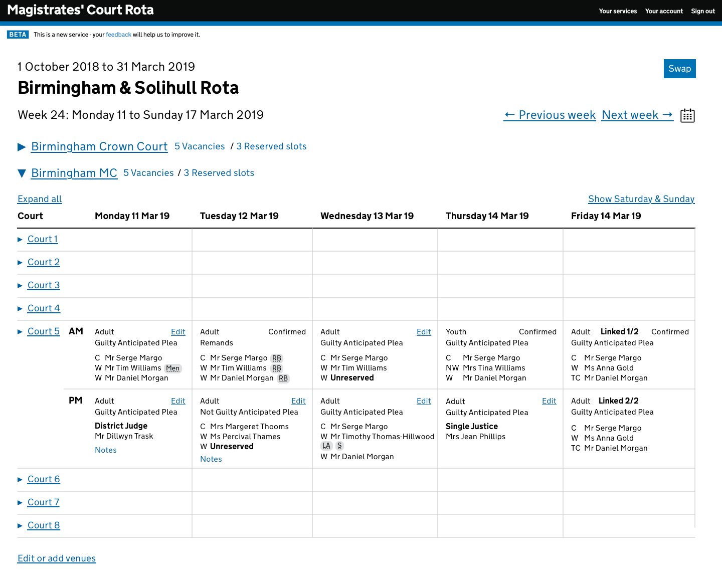
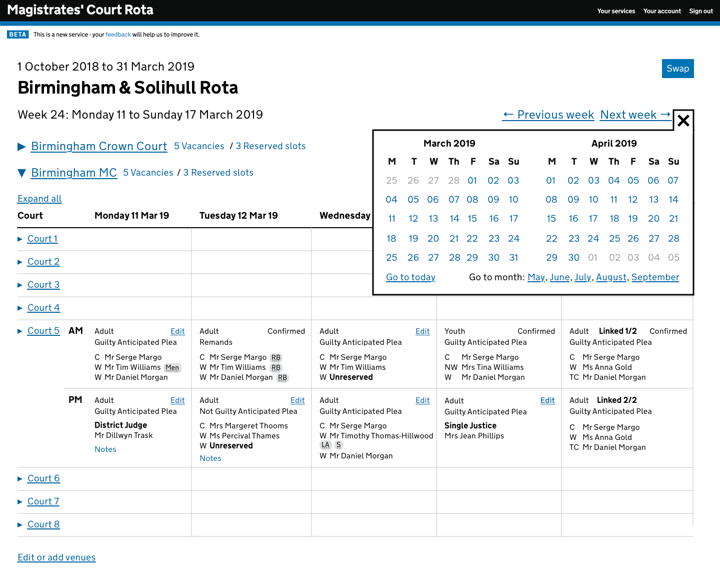
- The need to scroll horizontally to see Friday, Saturday and Sunday
- What is clickable and what’s not?
- Misaligned columns as users scroll down screen to different venues
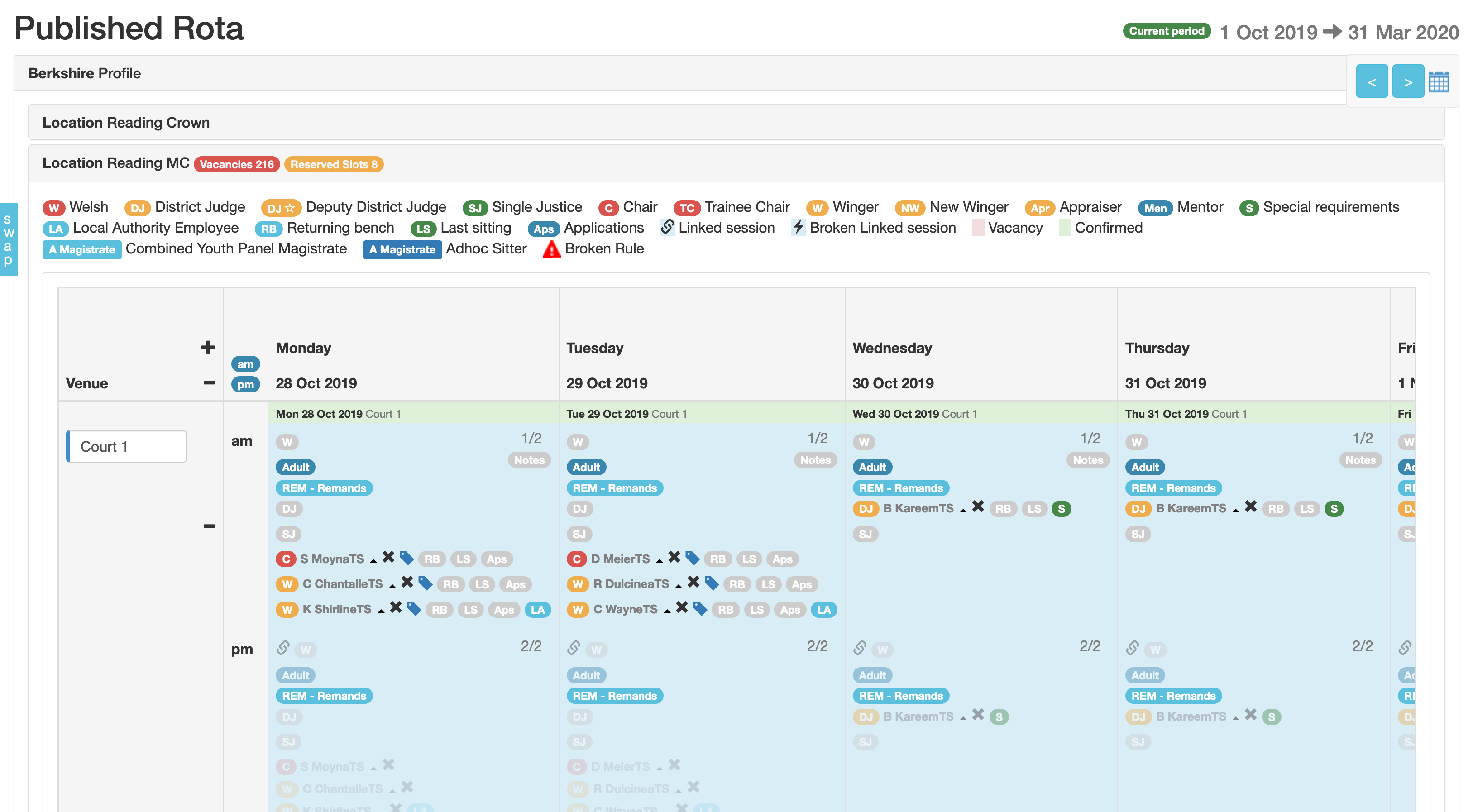
- Reliance on a key to describe what the multicoloured badges mean
- Key is repeated multiple times as you scroll down screen
- Lots of confusing icons/“badges”
The key thing was that rota administrators had to scroll horizontally to see the entire week of session information. But realistically, administrators had learned to deal with the quirks of this design, and put up with it out of necessity.
Constraints
Tasked to complete development and release the redesign before the new rota period in March.
The UX problem – “What is clickable?”
The entire screen was clickable but not visually indicated as such. This led to confusion, especially for new users asked to “confirm yesterday’s sittings.” Experienced users knew these quirks, but new staff were frustrated.
Actions and achievements
Discovery User research
- 101 users responded to a questionnaire
- 90%+ struggled with horizontal scrolling
- Users liked the current design due to familiarity
- Wanted it easier for new users
- Too much time spent on training
Prototyping
Functional Sketch prototype:
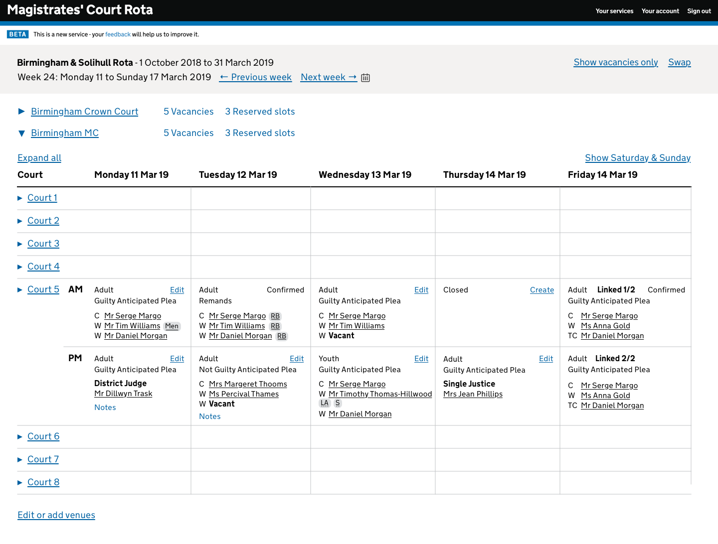
- Redesigned the calendar view:
- No more scrolling
- Aligned columns
- Accessible badges using
acronym - Removed keys
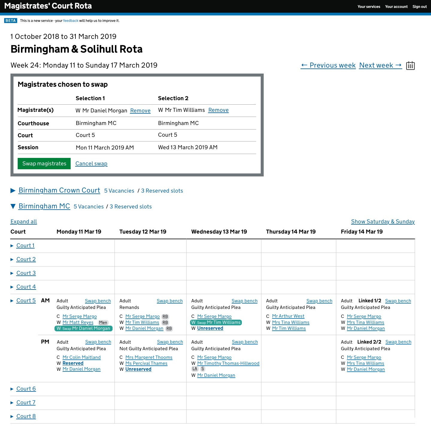
- Redesigned magistrate “swaps”
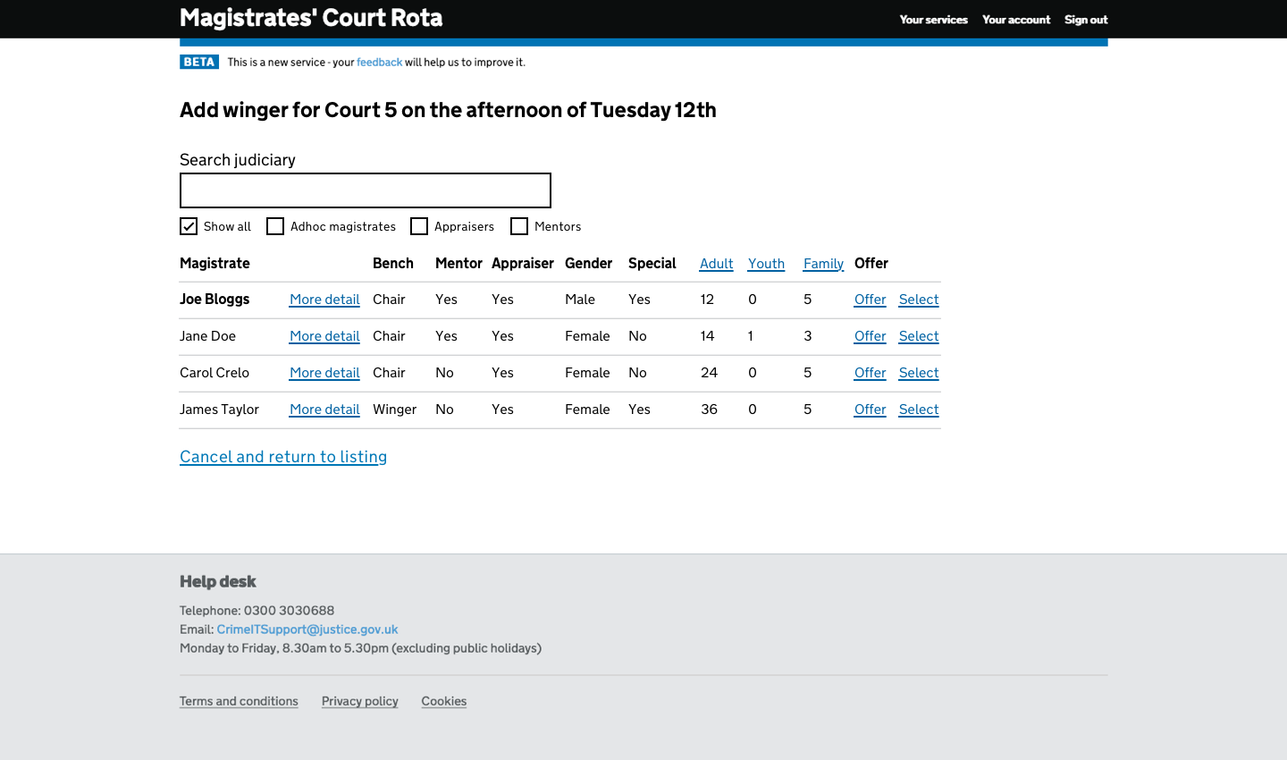
- Judiciary search engine
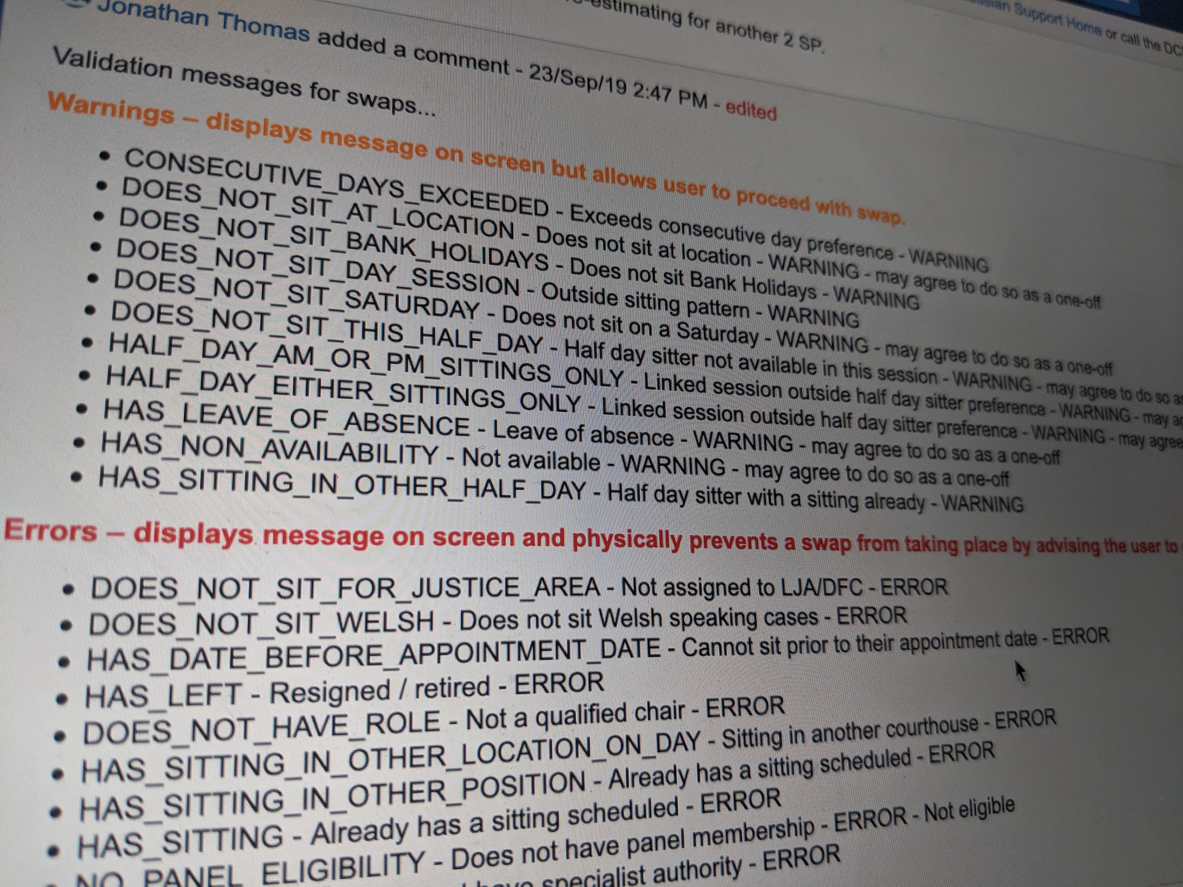
- Validation
The redesign was well received, despite initial hesitation around colour removal for accessibility.
Swaps
- Overhauled the swap UI
- Defined error and warning rules
- Added validations
- Users praised it
“The ‘Swap bench’ functionality is much better than the current system. And swaps are quicker!”
Team Collaboration
Worked closely with lead developer, tester, and BA for quality delivery.
Show and Tell
Led three sessions with LJA representatives for early feedback and iterative improvements.
User research
User testing
Despite initial complaints about lack of colour and additional screens, users completed tasks quickly and confirmed usability.
Post-testing iteration
- Vacancy visibility: Added toggle for “Show vacancies only”
- Swap button visibility: Made top bar sticky
- Swap box issues: Moved to sticky top bar
- Calendar reopening issue: Preserved open state

Lessons learned
Users
Hard to get enough direct user interaction.
Limited User Research
More rounds would have improved the design.
Development before Testing
Premature development led to costly post-test revisions.
Design Constraints
Minimal deviation allowed from current user expectations.
“Like for like”
Some features had to be restored in original positions for user comfort.
Summary and outcomes
- Successful redesign
- Intuitive UI for new users
- Strong trust built with client and users
- Sketch prototyping proven effective
- Long-term savings from reduced training overhead
Screens, design decisions and patterns
Judiciary menu reinstated after user feedback .
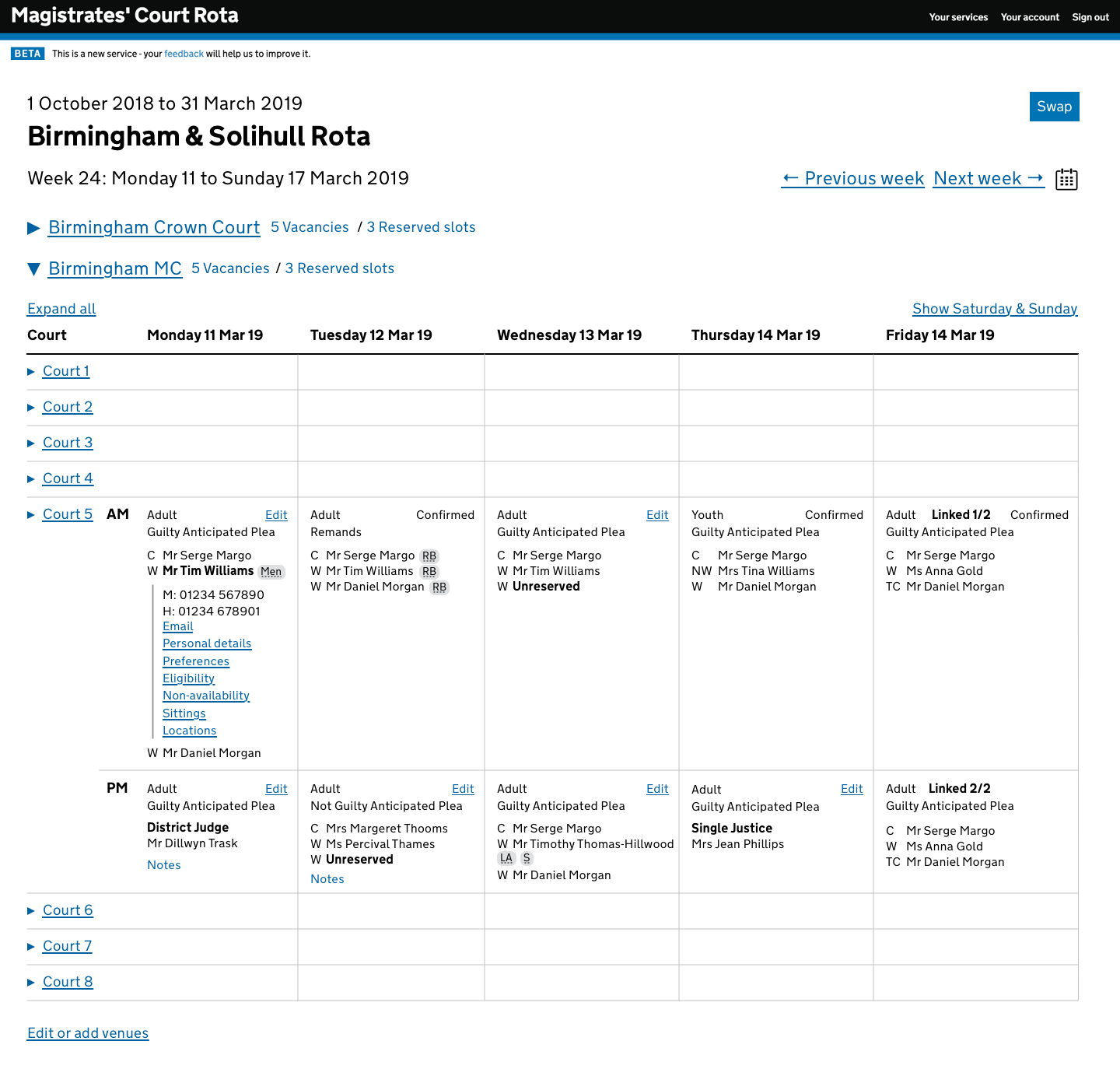
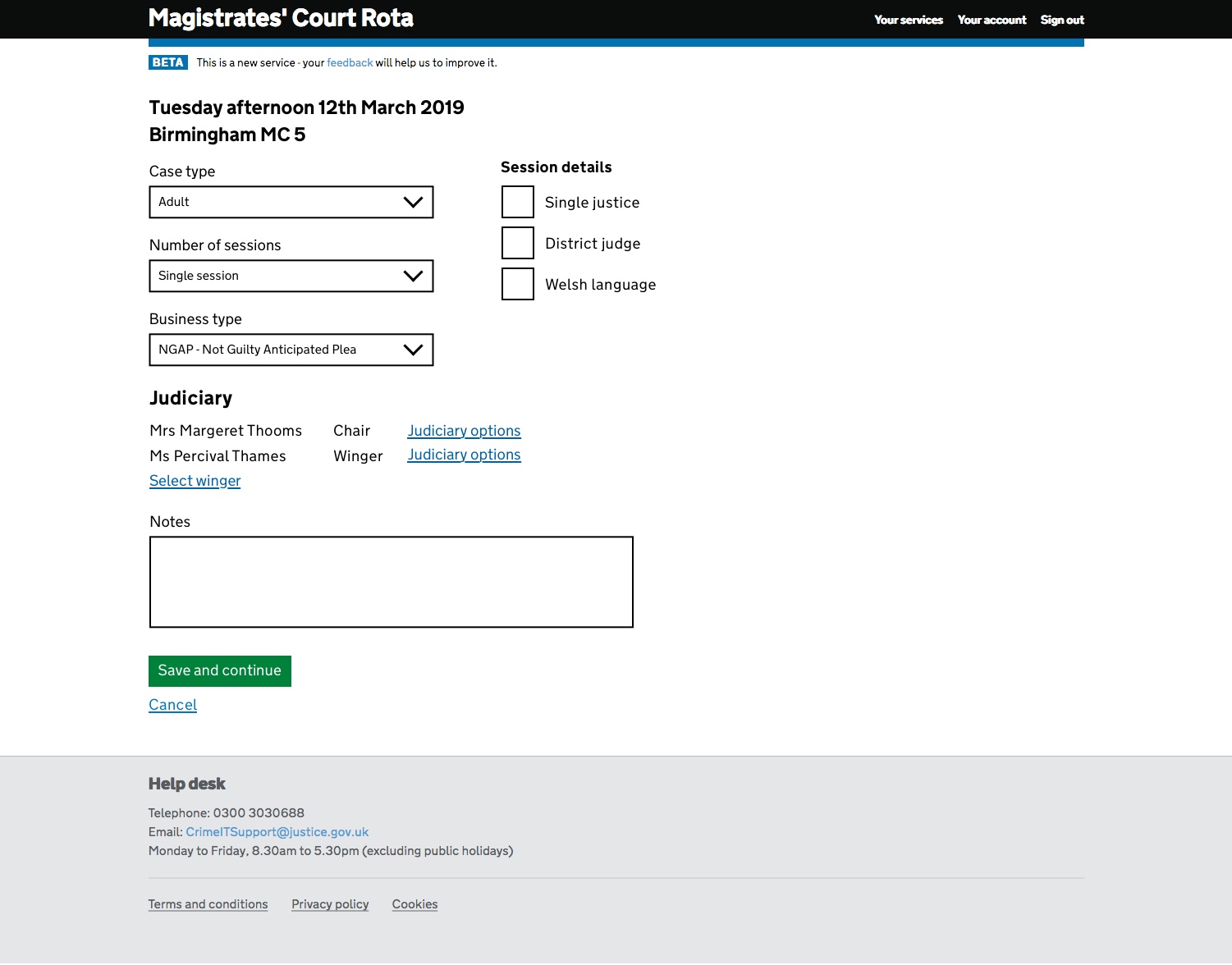
Session edit moved to dedicated screen.
Calendar styling rethought for accessibility.
Judiciary search moved to a dedicated screen.